Assessment Drawings
|
|
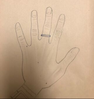
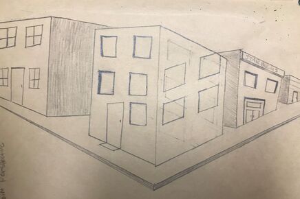
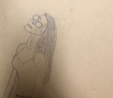
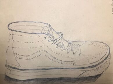
For this assignment, we were tasked on the first day of the new semester to draw your hand, self portrait, 2-point perspective, and a shoe. We were assigned to draw these to our best ability. We had to draw these with no help or references. These 4 drawling were to see where our art skills were at and to be evaluated to see if we knew any drawling techniques. Each of these tested our ability of certain skills.
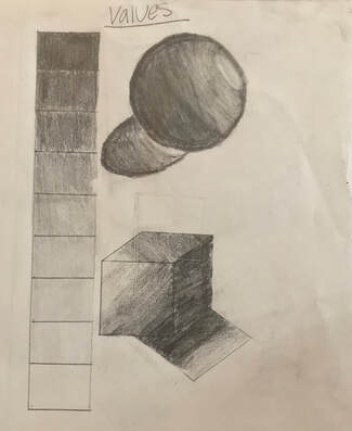
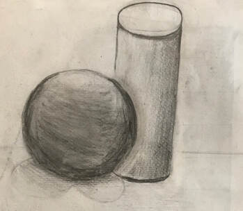
Still Life Object Practice
|
|
In the Above drawings, we practiced drawling values and still life objects. In the left-most picture we practiced how to draw the 7 different values with our pencils, we learned as you go down on the value scale you lighten up the weight on the pencil causing it to give that "lighter value effect". Once we finished learning value we practiced how to make a shape have shadow. With the circle you have to go light to dark in a circular motion to show where the light hit the shape. With the Cube you do the same thing: light to dark. In the right-most object we looked at still life objects; a sphere and a cylinder. WE had to place them on a table to make them overlap each other and draw that over lap. We had to draw it to where when you look at it, you could tell where the light came from.
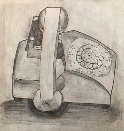
Final Artwork-Still Life Object
1. Describe how you arranged your composition. Discuss your use of the elements and principles. It it a successful composition?
The telephone was already arranged the way we were supposed to draw it. But we could chose the angle we looked at it. I choose to look at it from straight on because the telephone was right in front of me. The light was coming from above in the middle so that is how it draw it on my paper. I think this is a successful composition because it was my first time drawing a piece with value. I think i did a good job of drawing it how it looked. I do think some of my values could have been better like the bottom shadow where its supposed to be on the table. It was had to make it look realistic
2. Did you use a wide range of values? ( A range from white to black with at least 9 values) Explain how this is evident?
I did use a wide range of values to show were the light was coming from and to make this telephone have contrast. For example in my shadow that is supposed to be on the ground showed 9 shades of value and the sides of the telephone had values. It is evident i used at least 9 different values when observing my drawings because i draw shadows that went from dark to light and light to dark; to create the effect that the light came from above.
3. Explain how your knowledge and creating practice studies with value contributed to your piece?
I did not really have prior knowledge of creating values because i didn't remember doing a project with value in art 1. I just knew value went from light to dark. As a practiced i learned that you have to lighten up on your pencil to make it lighter and to give that more "natural" look. Practicing really helped me prefect my final piece and helped me know how to make the values go from light to dark. The amount of pressure you have to use really helped me create a more realistic drawling.
4. Describe the blending and transitions in your objects (discuss your use of pressure with pencil and other techniques to achieve this)
I had to use different pressures for each value that i created to give it a contrast. Like at the bottom of my piece where it looked like it was on the ground i had to use less pressure as i was going down to create a lighter value. I had to use light pressure when i draw inside the telephone to show where the light was coming from. For around the telephone i had to go dark to light to show the effect of shadow.
5. Explain how you interpretation of texture is essential in capturing the look of the object.
I had to use different textures to make the drawling look more realistic and create contrast. So in the telephone i had to make look darker at some points to give it texture. I had to move my pencil from left to right without creating pencils marks.
6. If you could recreate your pieces what would do differently to enhance the final outcome?
i could re-due this final project i would not make some of my shading so dark and do better at trying to not show my pencil marks. I would also make my values more distinct so you could clearly see where it went from light to dark.
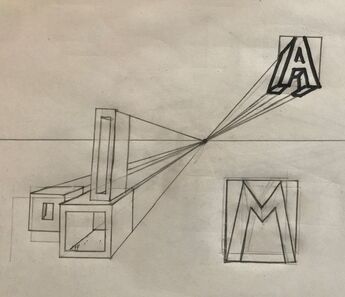
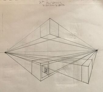
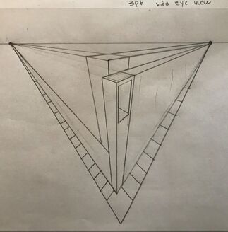
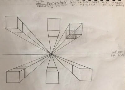
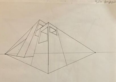
Perspective drawing
|
|
We were tasked to practice different perspective drawings. Mrs. Rossi guided us in learning how to do so. First she taught us how to make a basic 3-d cube and block letters, next was 1-point perspective, then 2-point perspective, after that was 3-point perspective, and then last was birds eye view. In each perspective she taught us how to line up the lines to each focal point. These practices helped me with my final project and learning how to line up lines to the focal point to achieve the perspective you are going for.
Final Artwork- perspective drawing
|
|
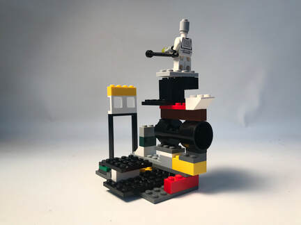
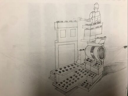
For this final project we were tasked to create a Lego statue with positive and negative space then take a perspective picture of your sculpture (2-point perspective) and draw it using your focal points. It was very hard at first to start this drawing but as you get on with lining up your cube lines it got easier by the end. The practice drawings really helped me figure out how it should and should not look. This was probably the hardest drawing piece I've done but i learned a lot.
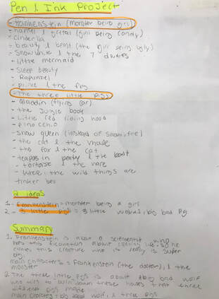
Pen And Ink Project
|
|
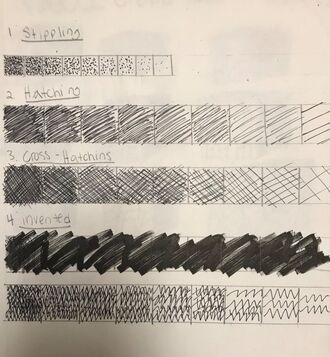
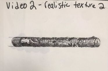
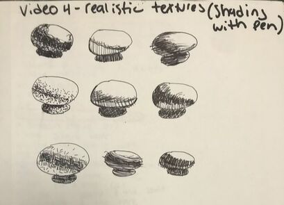
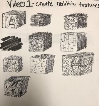
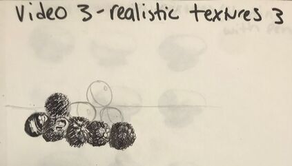
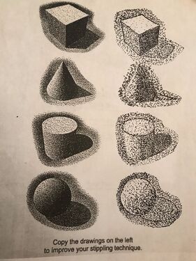
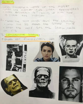
We were tasked to do a value chart for the different techniques of pen and ink and watch 4 different videos of a guy teaching us pen and ink techniques. The first video were practiced how to draw cubes and draw patterns and lines to create value and shading. The second video we had to make a sphere and do the same thing as the first video and create a shadow to show where the dark and light areas are. The third video we drew circles and filed them with lines and patterns to show value when the circles are stacked on each other. The fourth video we had to use 9 different pen and ink techniques to show the values and shading in it. After all the practice, we received a worksheet and had to practice stippling with different three dimensional objects.
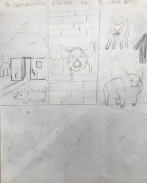
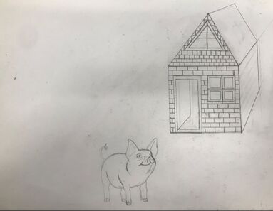
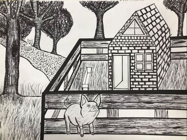
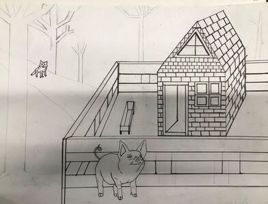
Final Project- Pen And Ink
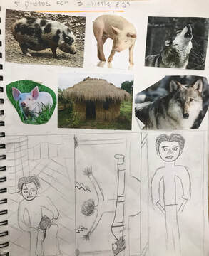
Brainstorming, both sets of my compositional sketches, references, and final sketch
|
|
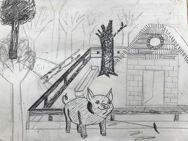
3 in progress photos
|
|
Final Artwork
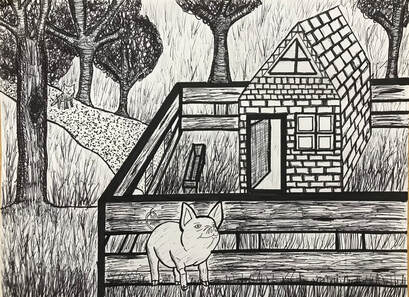
1. I used all 4 pen and ink techniques in my drawing. The first technique i used is stippling. The reason i chose to use this for the mulch and in-between the brick is because for the mulch it gave it a grainy kind-of texture and for the bricks it signified the grout that bricks have in-between each one. The second technique i used was hatching. The reason i chose to use hatching for the trees and the fence was because the lines made it look like they were made out of wood. The third technique i used was cross hatching. The reason i chose to use cross hatching for the side of the trees and the door was because it gave them both dimension. The fourth technique I used was invented. I chose to use invented for the tree leaves and the grass is because there was no set design for them so i just use swerves and lines that went to the side.
2. In my pen and ink final i used perspective to create my fence, the brick house, and the pigs food thing. I accomplished this by using 2 vanishing points; one for the house, and one for the pig pence and the pigs food thing. i had to make sure each line connected to the vanishing point to give it perspective. My perspective was if i was was standing on the ground looking across the land and standing in-front of the pig. Perspective is important because it gives you that three-dimensional feeling to a flat image. It also represents the way that objects appear to get smaller and closer together the farther away they are from the viewer.
3. Texture refers to how an object feels or how it looks like it may feel if it were touched. texture is important because it allows you to visual what the piece looks like, for example; how it looks and feels. For my piece i used texture that represented wood on my pigs fence. Without me using texture of wood people who are analyzing this piece might think its made up something else and not understand it. Also another example is how i creating the bricks for the house and how the lines are not perfect. I did this because the person analyzing this piece can under stand its the brick house in the three little pigs.
4. Value is how the light reflects off objects and how we see it. The more light that is reflected, the higher the value. Value is important in this piece because it allows me to create the illusion of light through value and contrast. It also allows the person that is analyzing the piece on how close they were standing in the piece. For example i had to create grass all over the white spaces. The darkest grass is right on the bottom of the piece because my perspective was someone looking at my piece straight on; hence why the grass is darker at the bottom.
5. I think i had good craftsmanship in my project. I used all 4 pen and ink techniques in my work and i used the right perspective for each thing. I tired my best to ask my art teacher if this was right so i could present this project to my best ability. I do think in some parts i could have tested out more techniques like for the grass and the texture in the pig. But other than that i tired my very best to make this artwork presentable.
6. If I could re-due my piece i would try more techniques to see what looks the best in each place. For some spots i tired many techniques to see what look best but in other places I didn't try a lot of techniques.
7. I chose to do the three little pigs fairy tale. I represented the story in my own way because in my version the pig was chubby and was surrounded by a pig fence and i created how i thought the pig and wolf should look like.
8. When applying the pen and ink techniques it was very important to make sure you understood the concepts taught in class because the people analyzing you piece could understand it. You also needed to learn how to create texture and value the right way so it could make your piece looks better, Without learning the techniques of pen and ink my final project would look like a disaster.
9. As a growing artist I have learned that a final sketch is very important because it shows you how the final piece will look. I also learned that you need to try a lot of different techniques to see which one looks the best. This project has taught me a lot about the different steps you need to take to have the best outcome for your piece.
Critique For Final Pen and Ink Artwork
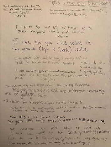
We were tasked to put our final art work out and put out a blank piece of paper with the title of our artwork. Then we had to go around the room and write a "critique" for each of our classmates artwork.
Colored Pencil Project
|
|
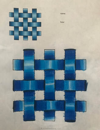
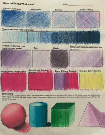
This was our first worksheets to help us get more familiar with colored pencil. The left photo we had to use different shades of a certain color and blend the colors to make it go from light to dark to create a weave effect. The right photo we learned different techniques for colored pencil.
Final Artwork- Colored Pencil
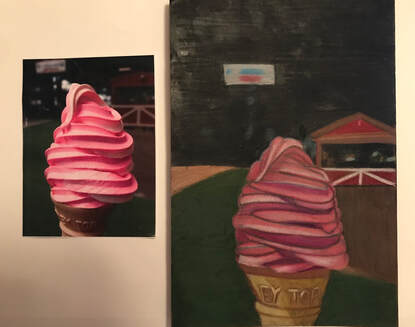
Due to the corona virus we were only able to do one project for the colored pencil unit. For this project we were tasked to pick out a picture with either an ice cream on it or cupcake. So i decided to pick the ice cream with the brightest color, pink. We had to use different colors of colored pencils to recreate the picture we chose. My art teacher told us we didn't have to use the same colors as the picture so instead of all pink i used some purple and brown. To make this piece look like the picture we had to blend the different colored pencil colors. It was very hard at first. I was worried that i would not do a good job because i never really had use colored pencils before to create a art work. But once i had outlined where all the lines were it was pretty simply. The only hard part was making sure you didn't press too hard on the paper when you used the colored pencils because it would cause it to be very hard to blend the colors in. This was my favorite project to do because in the beginning i thought it was going to be so hard but by the end i shocked myself and really loved how it turned out. The two practices we had helped me a lot with the final project. It taught me to not press to hard with the colored pencil so that it is easier to blend. It also taught me that you can use different colors other than the main color to create the tint and shade colors.
